Blank Starter Template
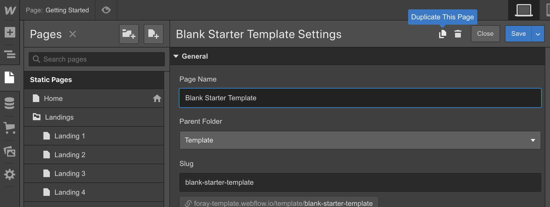
Inside the "Template" directory, you'll find a page titles "Blank Starter Template". This template includes a navigation bar, a footer, and a back to top button and is the ideal starting point for your pages.
1. Duplicate the Blank Starter Page template:
2. Copy and paste blocks to the newly created page:
Copy Sections from any page, then paste them into the body of your newly created page. Also you may copy panels from any of the panels pages listed under the Panels dropdown on the Navigation menu.
Style Guide
The Style Guide page demonstrates the display of all base elements found in Panels and is a good place to start familiarising yourself with the template.
Alongside the element demonstration you'll find instructions on how to correctly use the associated utility classes.
Editing Typography Styles
Setting header styles
Instead of using classes, you must click the header then in the Selector drop-down where you would type in the class name, select “All H1 Headings” then make your change. Same goes for all base heading elements. Click the element, choose “All heading 5”, then any changes you make to that will be reflected across all in the site.
Setting Body Text and paragraph styles
Follow the same procedure for body text and paragraphs - which are specified on the Body element. Select the body element, and from the Selector dropdown, choose “Body (All Pages)” and change the typography settings for that element. These styles then flow through to the paragraphs and other generic text elements in the site.
Structure
General structure
Each section should have the class Section applied. Each section should contain a div with class container as its first child. To arrange panels, place a grid inside the container (see below) or for a full-width panel, place the a div with class Panel inside.
Grids
This template includes a number of pre-defined grids for arranging panels within.
The most commonly used grids are:
- Grid Halves: [----] [----]
- Grid Thirds: [---] [---] [---]
- Grid Two Thirds: [------] [---]
- [Grid Two Thirds] [Reverse]: [---] [------]
Grids are configured to collapse and stack when the screen width reaches the appropriate breakpoint.
Panels
Apply the class Panel to a div to give it a distinct background with rounded edges.
The Panel Body class provides padding from the surrounding panel and contains all content within the panel. If an image is required at the head of the panel, place it outside the Panel Body.
Panel Body
The content inside the Panel Body is set to be split between the top and bottom. This way, it is possible to place a button at the bottom of the panel while the text aligns to the top. To achieve this layout, place two Divs within the Panel Body which will split your desired content between top and bottom.
Panel Height
Panels are designed to stretch and match the content on their surrounding grid. Images are an element that creates this height, however, sometimes there is not enough height in the content to force the panel to stretch, so it may be necessary to add a height class and force the height of the grid. Add the class Panel Height Large or Panel Height Medium to the containing grid to force the height and make the panels inside stretch.
Custom Code
Inside the Project Settings, in the Custom Code tab you'll notice some style code has been added to the head of each page:
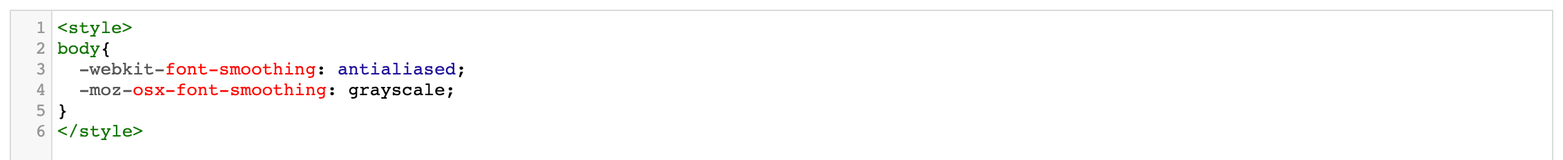
Font Rendering Custom Code
This code is to ensure that the text rendering is smooth and consistent across all browsers. It does not require any action on your part.
For further information, please consult the Webflow documentation or reach out to us via the Template Support Page.


